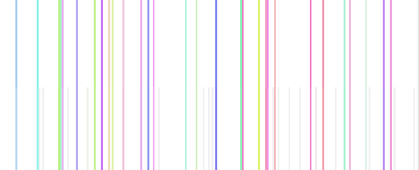

User activity
Engineering problems are often too abstract to catch the eyes of laymen, but a right representation can unveil the hidden beauty of the underlying arithmetic.
Inspiration exists, but it has to find us working
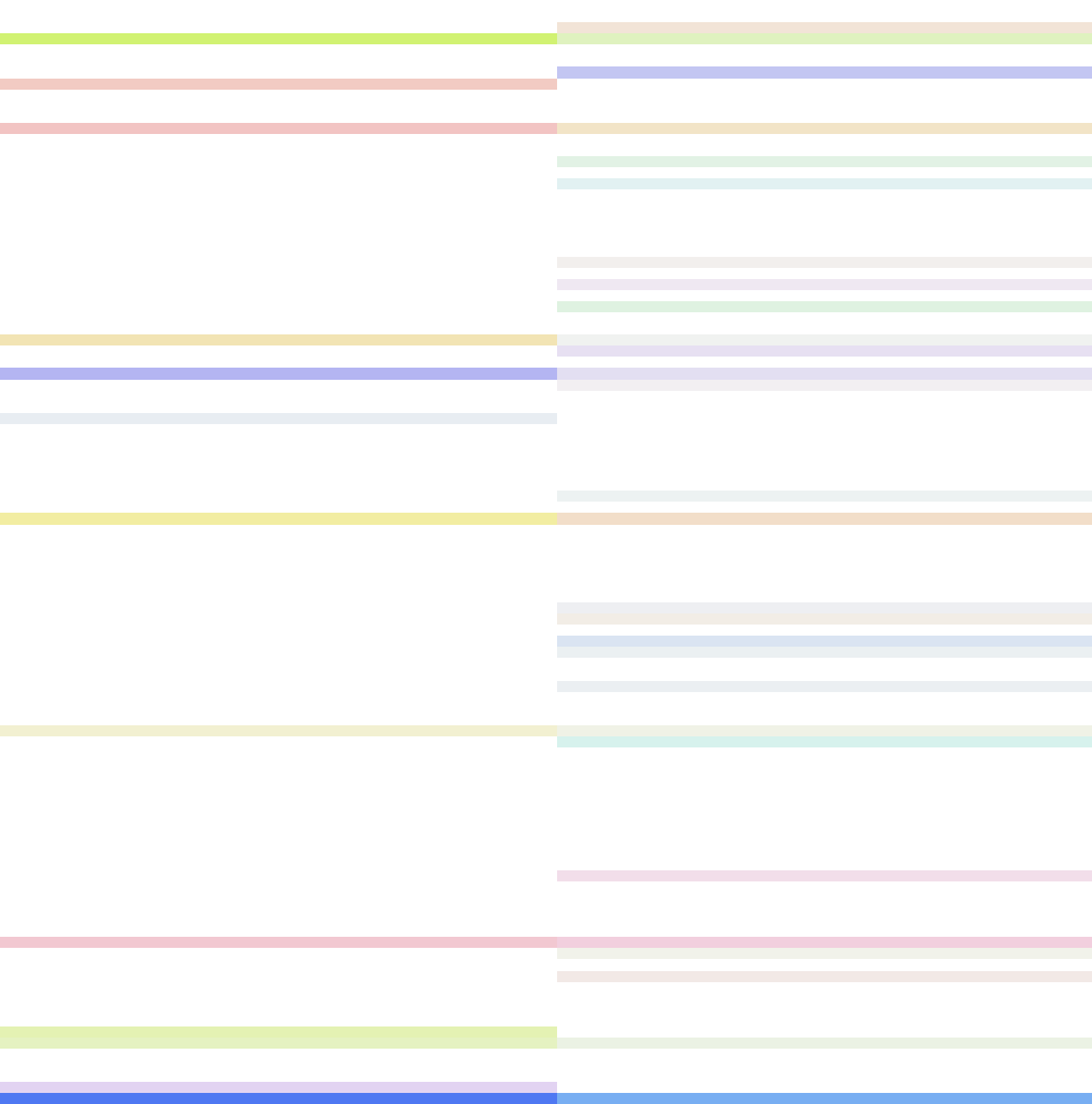
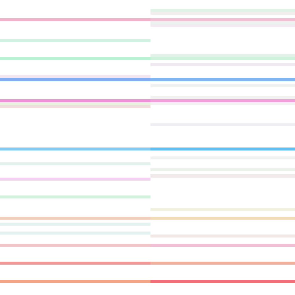
Take a look at the following images:

They are actually a by-product of a real project I participated in at work. We were exploring some strategies to enable massive connectivity in 5G mobile networks, which relied on reconstructing compressed information about mobile users’ activity. As I went through the implementation, I realized I needed a way to visually assess how good the reconstruction was doing, so by serendipity I ended up creating these minimalist patterns you could hang in your living room.
Massive connectivity and user activity
Let me first try to explain these concepts in the most informal (and tasty ) way I can before diving into technical details. Mobile antennas have a certain area of influence where they provide connectivity to as many users as possible using some available resources. We call our approach “massive connectivity” because we would even like the antenna to keep more users within its area of influence than the resources technically permit.
The reason why this is possible is because not all users want to communicate at the same time. Imagine a 5G antenna can exchange information simultaneously with 100 users. If the antenna knows that only 1 out of 10 users are indeed active at any given point in time, then it can promise coverage to up to 1000 users as long as the activity rate does not exceed that threshold.
In order to keep track of their activity, every user receives a unique word to transmit to the antenna whenever they want to connect. So for instance Alice will get the word Apple, Bob will use Banana instead, Carol will go with Cherry, and so on. If users start shouting their connection words all at once the antenna will not understand anything but fruity gibberish, as this indeed exceeds the available resources. On the other hand, if only some users do, it may manage to get the words clearly and tell apples from pears.
This is what I mean by compressed information. The only thing the antenna receives is a tiny and juicy fruit mix that will hopefully tell which users are active and which ones are not.
What you see in the pictures is a collection of color-coded user activity values, with every colored stripe accounting for the activity of one single user. Intense colors indicate intense activity, i.e., how loud the antenna perceives the corresponding connection word. On the other hand, white regions are groups of inactive users. On top of that, every picture contains two columns, left for the original information and right for the reconstruction.
Mobile radio waves, complex numbers and colors
You may think I chose such an eye-catching palette as a frivolous excess, just to have something to write about. I cannot deny I lent wings to my creativity, but this rainbow color mapping was also required by the way we encode user activity.
In order to communicate, mobile phones transmit electromagnetic waves. These transmitted waves traverse space and time until the antenna receives them, while their physical properties get transformed along the path. More specifically, their amplitude attenuates (they become more quiet) and their phase shifts (they arrive at a delayed point in time). What we encode as user activity is a compact representation of the amplitude and phase of the received “connection words” using complex numbers, which is technically known as fading.
If you studied complex numbers in high school you may have wondered why they are even useful, since they literally include an imaginary part. I hope you are glad to find out there are engineers out there squeezing their brains with imaginary figures to solve real problems.
Complex numbers
Complex numbers are composed of two values known as real and imaginary parts. This means that we can plot them onto a two-coordinate system, the so-called complex plane:

The complex number is shown using its real and imaginary parts as coordinates and drawing a line (vector) between these coordinates and the origin, the \(0\) value. This allows to represent amplitude and phase very concisely: the amplitude, marked as \(r\), is represented by the vector length, while the phase \(\varphi\) is just the angle between the horizontal axis and the vector.
Now, if we have a bunch of “normal” real numbers we want to assign colors to, the task is relatively easy: Check the minimum and maximum numbers to map, assign black and white color to them respectively and give any number in between an intermediate level of gray depending on its distance to the extremes. However, we cannot order complex numbers like that. A grayscale is not enough, we need a bidimensional representation of color.
Well, a wheel is bidimensional, so why not use the color wheel?
Color wheel
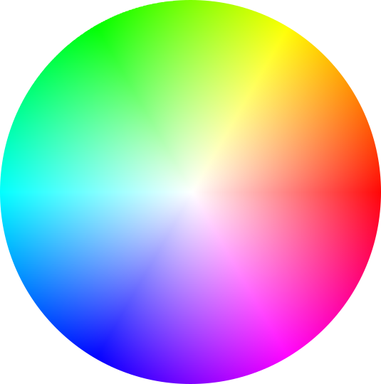
I could write a whole post about color theory, but let us restrict ourselves to the basics. The colors we perceive can be described by three quantities. Which ones? Well, there are a handful of different possibilities: RGB, CMY, YCbCr… but the most convenient ones here are hue, saturation and brightness (HSB).
The color wheel above displays combinations of hue and saturation values for full brightness. Colors at the edge are fully saturated and the saturation gradually decreases the closer colors get to the wheel center. The hue is given by the angular sector or piece of pie we slice out of the wheel.
As you see, talking in terms of angle and amplitude comes in naturally. We can thus extend our color wheel as a picnic blanket on the complex plane until we cover all the complex values we want to represent.

There we go, we have found a way to assign colors to complex numbers. Since numbers that lie close to each other in the complex plane also have similar colors as per the color wheel, we can verify very quickly how faithful the reconstruction is by placing it side by side with the original information.
This also explains why inactive users are given a white color. Their user activity equals zero, as they remain quiet without issuing any message. Now pay attention which color the zero value is assigned by our color mapping. Blanco y en botella1.
Note So far, this color mapping assumes that color brightness is fixed. In my experiments, I set brightness to 95% but I raised it to 100% for those values equal (and not only close) to zero. As a result, all non-white colors are a little bit darker than in the displayed color wheel and the reconstructed values which should be zero but are only close to zero appear as light gray stripes.
Reconstructing compressed information
Retrieving a large amount of data from a reduced combination of their elements is a challenging problem in the field of signal and information theory. In fact, high school math will tell you that you will fail to solve the problem if you try to write the equations down.
In our project, we used a technique called compressive sensing that has been around since the late 2000s. Its applications extend far beyond mobile communications, as they are mostly related to the acquisition of a signal from a reduced set of measurements. To have a feeling of how powerful this technique can be, I really encourage you to have a look at this magnificent Wired article from 2010. There the reader is provided with a non-technical overview on the topic and how it was applied to magnetic resonance imaging to save a 2-year-old toddler’s life back in 2009.
Compressive sensing is an exciting research area, with hundreds of top-level scientists devoted to push its boundaries day by day. In our implementation, we used as a reference the work of Mark Borgerding, Philip Schniter and Sundeep Rangan from the Ohio State University. In their 2017 paper, they took an algorithm called approximate message passing and enhanced it by borrowing ideas from neural networks and artificial intelligence.
Further references
- Complex numbers - Wikipedia
- HSB color system - Wikipedia
- Fill in the Blanks: Using Math to Turn Lo-Res Datasets Into Hi-Res Samples - Wired
- M. Borgerding, P. Schniter, and S. Rangan, “AMP-Inspired Deep Networks for Sparse Linear Inverse Problems,” IEEE Transactions on Signal Processing, vol. 65, no. 16, pp. 4293–4308, Aug. 2017, doi: 10.1109/TSP.2017.2708040.
- Z. Utkovski, O. Simeone, T. Dimitrova, and P. Popovski, “Random Access in C-RAN for User Activity Detection With Limited-Capacity Fronthaul,” IEEE Signal Processing Letters, vol. 24, no. 1, pp. 17–21, Jan. 2017, doi: 10.1109/LSP.2016.2633962.
-
Spanish for “White and bottled”. This is actually a saying to point out something obvious, like the fact that if someone is talking about a white and bottled substance they probably refer to milk. ↩